

 Add to favorites
I have hinted a little bit here on the site that we have been busy with a studio kitchen remodel. The private Nouveauraw Facebook Group has been following the progress as I have been sharing regular updates over there. The other day, I received several comments asking me how I went about designing my studio kitchen space. I started to share over on Facebook, but it was getting so long that I decided to also share my experience and discoveries here on the site. You will soon see why… I have a LOT to share. Hehe Also, many of you don’t do Facebook and be interested in this topic as well.

It’s good to note that you can use the suggestions below as a design approach for any space in your house. I am merely sharing with you how I approach design and decor. Kitchen designing isn’t my profession… but working in one is… and I am excited to share my thoughts with you. It’s also important to know that the space I designed is suited for my particular needs, which will undoubtedly look different for you. That’s ok; the same principles can be applied to your situation. I should also note that my studio kitchen isn’t finished yet. We still have one wall to complete, but we had to take some time off to deal with other life commitments. So, let me tell you a bit about the studio kitchen that I have designed; then, I will break my approach down below.
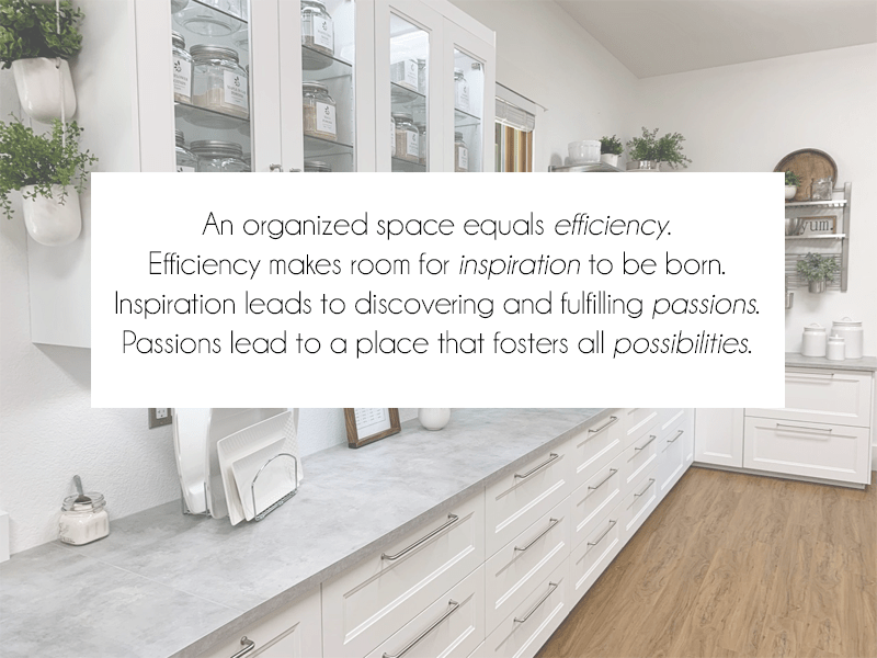
I have been creating this Studio Kitchen with the help and support of my loving husband, Bob. We have done 100% of the work. This space is 656 square feet. It was once a two-car garage, converted to a commercial kitchen for food manufacturing, and is now taking on a life as a Studio Kitchen. During the build-out, Bob had a vision, and the phrase “The Room of Possibilities” departed from his lips. It is so true… the whole purpose for this space is to CREATE, to let INSPIRATION run wild, and to fuel the passion that is deep within me and for those who enter it.
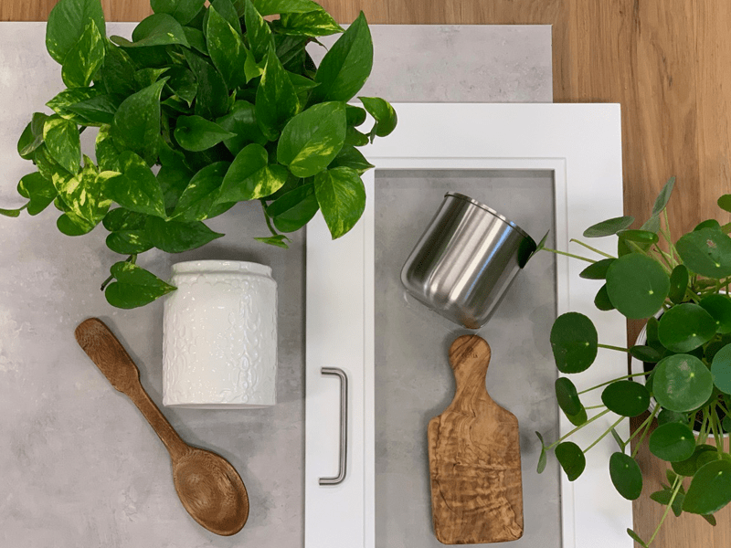
I named my style Industrial Farmhouse. I pulled together different colors and textures to create a sample board of the overall feel that I was aiming for. This gave me a visual, which also helped me stay on track with my plan. Trust me, bright shiny objects will come your way, and when they do, you need something to keep you focused. Let me explain what and why I selected these for my design. That’s not to say that as you build,/decorate a space that things won’t change. We’ve had two design changes along the way, but we made sure to think it through before activating them.
When it comes to decorating, I tend to use the repetition of items, materials, and colors. This means that I tend to repeat a pattern, color, texture, line, or any other element to help relax the eye when a person enters a space that I have laid out. As you read through my color choices and the materials I selected… see if you can get the “feeling” that I was aiming for as you look through the photos I have attached throughout this post.
We all lead busy lives, and there are times when we have to pick and choose where we want to dedicate our energy. Is endlessly searching for an item or ingredient in your kitchen a way that you want to spend that energy? To reduce the time spent looking for objects, we need to implement an organization. Remember me mentioning that it’s essential to know how you want to use your space? Once you know this, you can better organize it. So grouping like-items or task-driven items is crucial, and there are so many organizational tools that will help you achieve this.
In kitchens, you typically see cabinets and drawers being used to store your goods. Cabinets on the bottom, topped with a few drawers, and cabinets above with shelves. They are the norm of kitchen design, but how and where we use them can be a game-changer. This day and age, there are more creative options. Here is a link to IKEA’s kitchen cabinets and drawers, which I will be talking more about later.
When I designed my studio kitchen, I decided that drawers for all lower cabinets were going to benefit me the most. No more losing items in deep dark cabinets where spiders and who-knows-what-else lives. And boy, was I right. I am still in awe of this decision. I could select anywhere from two to six drawers per cabinet. This is when my inventory list of what I already had and what I needed helped. The drawers extend entirely, giving me complete access to my kitchen tools!
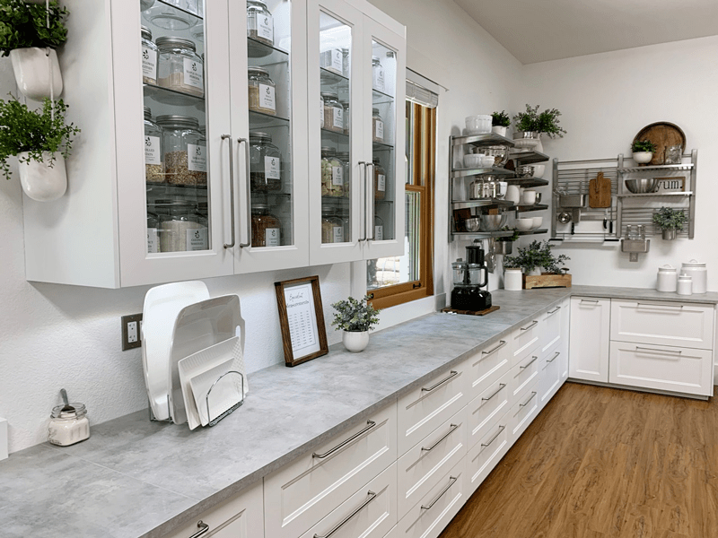
For the upper cabinets, I selected doors with glass fronts. One section of these glass shelves is dedicated to my dry ingredients, which are housed in glass jars/containers. I positioned these above a counter that I will mainly use for mixing, blending, and food processing. I designed for this counter to run under two windows that bring me joy and sunlight. I will touch base on that later.
The other upper cabinets that flank the fridge and freezer are also made with glass fronts. I wanted glass in these because I knew that I would be displaying my catering and photography dishware in these. I filled them with white and stainless steel. Both colors are versatile for any event I am hosting, and they accentuate the beauty of the foods I create. I also love heavy ceramic bowls. It reminds me of when my Great Grandmother would stand in her kitchen with a massive ceramic bowl in the crook of her arm, resting the bowl on her hip, while briskly stirring the ingredients within it with the other hand. All while attending to the endless questions that I had as a child.
I shared above why I use stainless bowls too, but another reason is because of their crisp and smooth texture. This will sound odd, perhaps… but those textile feelings remind of being a little girl curled up in my mom’s lap. She always had gorgeous long fingernails that I greatly admired. To self-soothe myself, I would bring her hand to my mouth and brush her smooth, cool nails along my bottom lip. To this day, I find myself doing this same action (except with my own nails) when I am gazing out in space, ponding things.
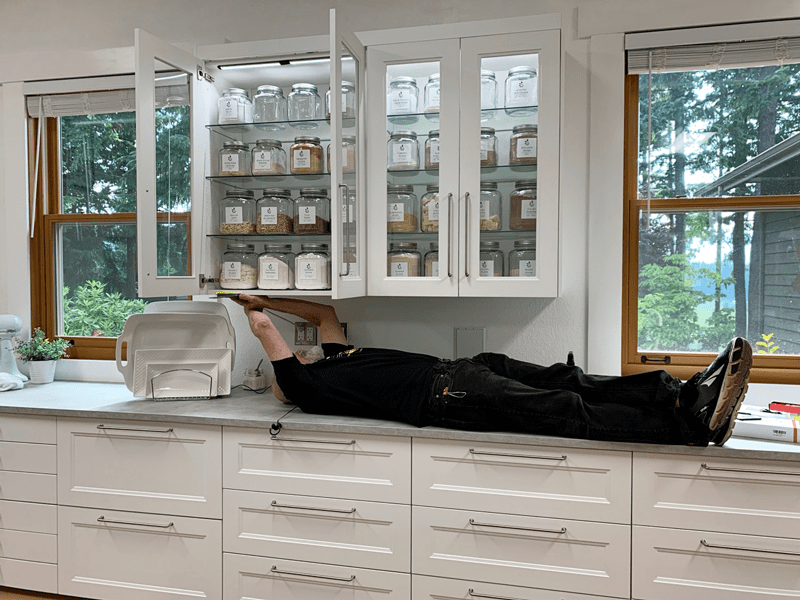
So, that is why I decided to “showcase” these items in glass doors. They make smile, they warm my heart with memories, and satisfy my culinary needs. In all of the upper cabinets, Bob installed LED lighting strips inside of them, which is a beautiful feature.
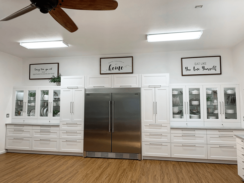
On the wall housing the fridge and freezer, I flanked them with 90″ tall pantry cabinets. Again, I was able to alter their design, customizing them to my needs. I put three drawers in the base of each one, side to side swing-out-doors in the center, and a door that lifts on the top. One of the side pantries is set up to house more ingredients; bottles, bags, cans… stuff you don’t want to be seen. Again, I controlled where the cabinets would be so I could avoid deep dark pockets of the Twilight Zone. The other tall pantry houses all my large party hosting decor and some appliances. I have to stop for a second to give a shout-out to my dear husband. This all couldn’t have happened without his Jack-of-ALL-trades and mathematical skills! Getting all of these cabinets/fridge/freezer/and drawers to line up perfectly is pure magic if you ask me. hehe
I have already touched a little bit about why I went with drawers. To me, they are just flat out amazing. They are the best organization “tool” that I have yet to find in any kitchen space. I put in small (4.75″ deep ), medium (9.75″ deep ), and large drawers (14.5″ deep) throughout the space. That way, I can fit everything between a spoon to a blender in those drawers! The whole drawer thing was my saving grace in making my kitchen studio 100% functional and efficient.
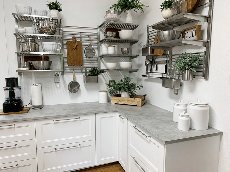
This won’t always be feasible in a kitchen space due to size and aesthetics, but for my area, it was perfect. I selected an open shelving system that allowed me to display it in any configuration that I wanted! To me, it’s functional, creates efficiency, and is beautiful… all rolled into one. I presented a mixture of everyday items that I use, along with some decor items (but made sure that I didn’t get to carried away with tiny tchotchkes (knick·knack) things). Everyday items can become “art” too. The use of these shelving systems also kept the space feeling open and airy, as well as adding a balance of weight throughout the room. I used IKEA’s Kungfors system.
 Countertops
One thing that I learned about countertops is that they can quickly break the budget. I had no idea that such surfaces could cost so darn much. :) In my original design, I selected wood countertops. I was in LOVE with the IDEA.
But after we built the first wall and placed a section of the wooden countertop on the cabinet base, my LOVE started to waiver. The pattern in the wood competed with the patterned vinyl wood plank floor, it felt too dark, and then I began to think about the maintenance of it also.
Sure, I had thought of these issues before the purchase, but I was too in love with the concept of having wooden counters that it clouded my ability to think logically. Don’t get me wrong, I think they can be gorgeous, and worth the effort BUT I was out to create a space that required little to no maintenance, I wanted my energy to be used elsewhere. So, they were returned with no questions asked.
After weighing out the cost of other types of countertops, it was decided to get laminated tops. I selected ones that give the appearance of concrete. I never thought in a million years that I would pick such a countertop, but that’s what happens when you are open-minded. Hehe
There are a lot of things to take into consideration when selecting countertops, and if it had been my central house kitchen, I would have gone a different route. I used IKEA’s EKBACKENCountertop, light gray concrete countertops. The other day I did a stain test on a scrap piece that was leftover. I poured some beet juice on it and left it sitting overnight. The next morning I wiped it up, and it didn’t leave a stain or any marking. Yay!
 Flooring
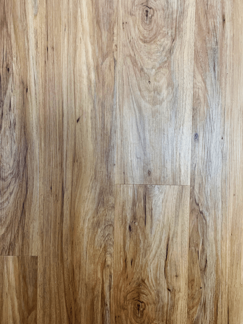
Ah, lastly, the flooring. Oddly enough, this was one of the first things that we decided on. I mean, I had already created an overall vision of the look and feel that I wanted in this space, but this was the first thing we did. Typically, flooring is the last to go in, but in my case, this isn’t your standard kitchen space, so we laid ours first. We laid snap together vinyl plank flooring. It took Bob and me ten hours from start to finish. The laying of the flooring wasn’t the hard part; it was the selection of it that almost drove us crazy.
We looked at 100’s of samples, made several choices, but in the end; we picked something different then we thought we would. This is what I learned:
For me, this was one of the most significant game-changers. Since I was taking this space from a commercial manufacturing kitchen and repurposing it into a studio kitchen… it meant that I could move the LOUD appliances out of the area. This above everything was most important to me. Running two commercial fridges, two commercial freezers, and a commercial dehydrator in that space caused a person’s ears to go numb after a while. With the decision to relocate these items, it meant that I could select appliances that were more ear-friendly. Though I will admit, it has been a challenge to down-size these items. So, what appliances did I choose?
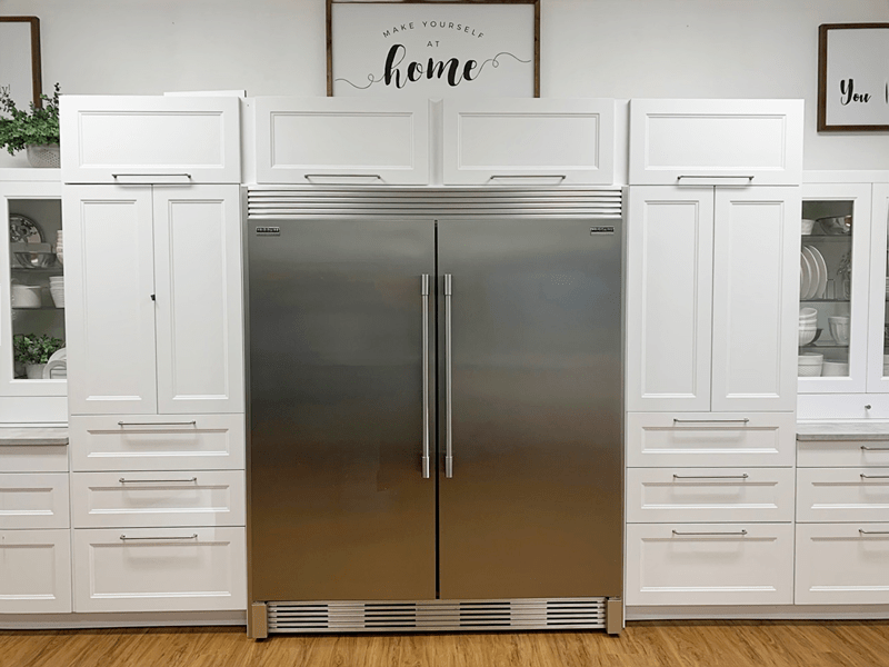
I went down the middle road again. I needed something larger than the standard house fridge, yet smaller and QUIETER than a commercial one. I wanted the inside of the unit to be as square and boxy as I could get. That way, the space inside would be efficient for my needs. Thank goodness, I found it! The Frigidaire Gallery 18.6 cu ft upright stainless fridge and freezer (2 units). BUT they were out of my budget. Throughout the time it took to design the kitchen, I kept looking for deals on these units. That was when I came across a deal on the local Facebook Virtual Garage Sale. I found those exact units for half the price, and they were only six months old. We also purchased a kit that tied to the two units together, making them look as one. Love it!
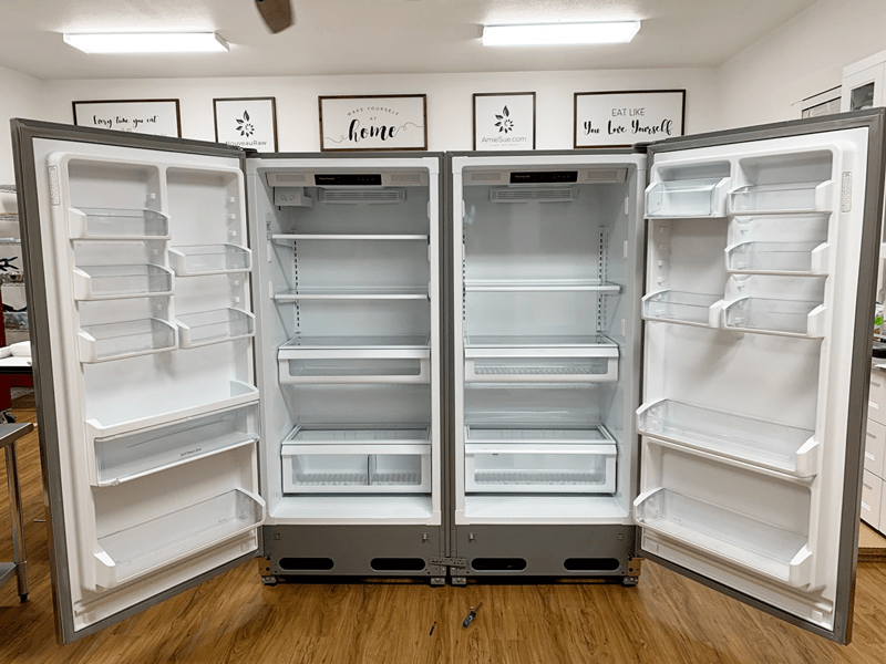
I had to share this photo because when I walked into the room, I found the fridge and freezer sitting like this. It was as though they were reaching out for a HUG. Lol, Have you hugged your refrigerator lately?
Things we didn’t know before purchasing the kit – You need the space to lay both units down to attach all the kit parts. Doing this means you need to find a place for all your fridge and freezer foods to live for 24 hours since once the units are upright, they have to be off for 24 hours before turning them back on. We were lucky; we had other fridge and freezers to put the stuff in, and we had the space to lay them down… this may not be the case for many people.
I already did a post on the Samson Silent Dehydrator, which you can read (here). Therefore, I won’t go into detail as to why I selected these units. We have yet to install these into their cabinet because we haven’t completed the remodeling job. Stay tuned for more updates on the last wall, which will house the dehydrators and a double oven. I heard your gasps. haha
I didn’t want to forget mentioning these two items because they were heavy hitters in my overall design as well. Air movement and lighting can make or break the layout of a space. Don’t believe me, step into a world-renowned museum that is filled with priceless, exquisite art… now turn off the airflow, feel how heavy and thick the air feels? Feel how suffocating it is to stand there? Now notice the lighting, they used light bulbs that are on the blue spectrum, and as it casts a light on the painting, it looks lifeless, dull… making it hard to immerse yourself into the mind of the artist? Ready to spend another two hours strolling through in this space? Not me said the plant-based chef. haha
Bob… installing the under cabinet lighting while he was jibber-jabbering away on the phone with a friend. He is a Jack of ALL Trades!
This is more of a complicated subject matter. Because lights come in different color tones called lumens and lighting can significantly affect the look and feel of a space. Since we had installed IKEA kitchen cabinets, we purchased their lighting systems. But once we installed one, we realized that it wasn’t exactly what we were looking for. Their lights have more of a yellow hue to them, which, in reality, is perfect for a typical house kitchen. But in my studio kitchen, I have fluorescent overhead lighting, which is more on the blue spectrum. Therefore I wanted the lights in my upper cabinets to match. That way, my light hues weren’t competing with one another.
Since my sweet husband has a lot of experience with lighting, I leaned on him heavily to help resolve the issue. I have heard of him refer to Kelvin Color Temperature, which as to do with color temperatures. If you wish to read more about this, which I highly recommend, if anytime you are looking to add or upgrade lighting.
(Bob here, I also matched the color temperature of the cabinet lights to the main room lights. As Amie said above, color temperature is expressed in K (Degrees Kelvin). Incandescent bulbs tend to be a warm feeling about 2700K. In this space, we wanted to have a color closer to daylight and went with 5000K. These ratings for bulbs can change the feeling of a room. Here is a link to more info about color temperature: http://www.westinghouselighting.com/color-temperature.aspx )
Bob ended up finding some through Amazon, and to sweeten the deal, they were even less expensive than IKEA. I love saving money. :) The ones he selected are lighting strips, which he installed under one set of upper cabinets as well as inside the glass cabinets.
Outside of the aesthetics of creating my studio kitchen, there are areas of practice that we always need to address. Below I will run through them… all of what I am sharing is how I finalized my design. But I am also sharing “food for thought” with you so you too can apply any or all of these ideas to your own designs.
With your list of needs in hand, it’s time to start designing. I thought I was going to have to do this in my head. That overwhelmed me, so I tried to hand draw my space… that turned into a bad looking cartoon. Lol, We then found out that IKEA offered (for free) a 3-D Kitchen Building Program. Even if you plan to go a different route, you could use their program to plug in measurements, cabinets, etc. to get a visual.
I am 100% a visual person… meaning I need to SEE things. I FEEL a space within me, but I can’t see it. That goes for everything I do in life. I hope that makes sense. So having this 3-D tool was a game-changer for me. It gave me my vision in 3-D from all sorts of angles, and it kept a running tally of what we were spending. Before knowing they offered this, we spent quite some time researching different cabinet companies, and in the end, we decided on IKEA. At first, Bob was against it. Still, after I did TONS of research, blog reading, review reports, and then actually going and physically inspecting their kitchen products, we felt that we were getting good quality as well as a reasonable price!
Ok, if you made it to the end of this post… I curtsy and applaud you! I didn’t mean for it to be this long, but details are important when planning such spaces. I hope you found this helpful. If you are thinking, dreaming, planning, or currently in the midst of a remodel… remember that YOU CAN DO IT! Bob and I just jumped in and tackled this project. We approached each step with grace and ease, we never had a crossword with one another, we listened to each other’s thoughts and suggestions… and we had fun! There is nothing more rewarding then walking out of the studio kitchen, turning around, and saying, “Wow! We built this!”
If you have any further questions or want more details on a topic, let me know. Stay tuned for the progression of this space! More to come! blessings, amie sue
very nice
What an awe inspiring kitchen! So refreshing, functional and inviting!
Thank you so much, Teresa. This is my home away from home. If you can’t find me somewhere in the house, you will find me in my studio. Bob loves to lay on the couch out there and read. It’s been several years since we completed this space and it has been used for so many wonderful projects and events. blessings, amie sue